Rare Bits Redesign Exercise
Problem
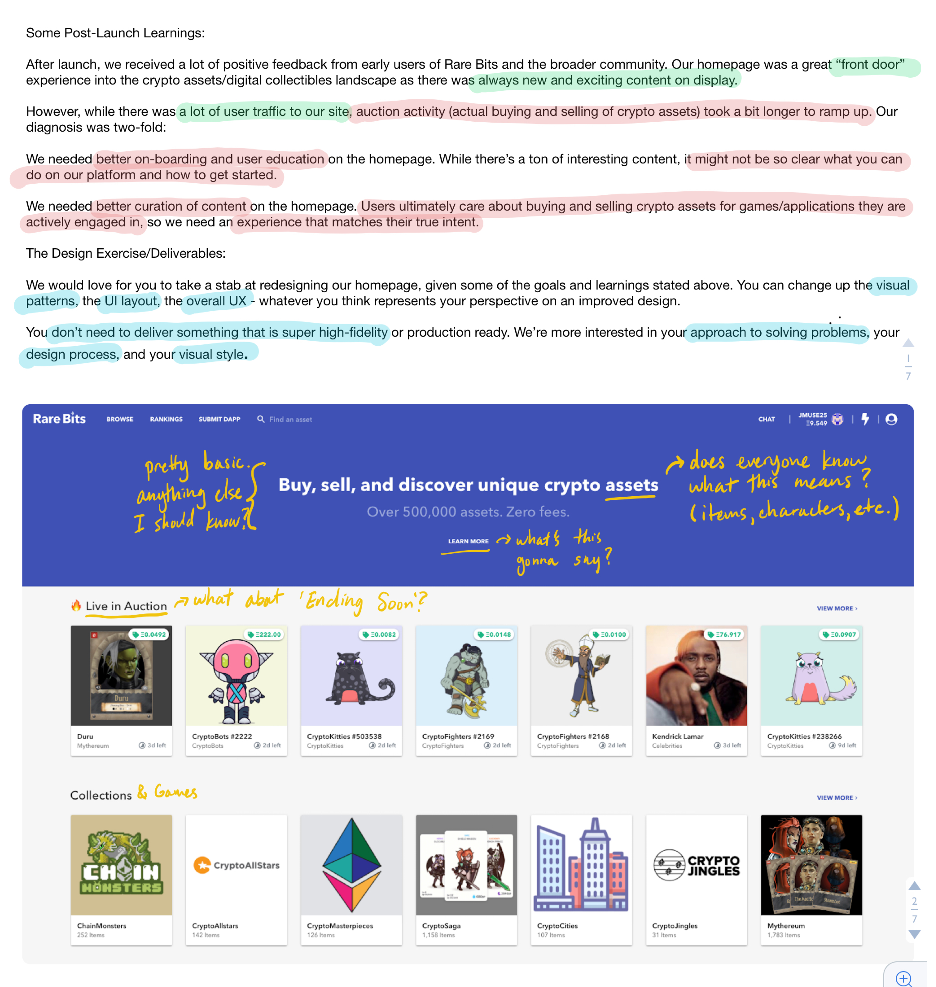
The current Rare Bits homepage attracts a lot of traffic, but new user auction activity is slow to ramp up. The team hypothesized that the home page needs better onboarding and user education about the platform and its capabilities.
Solution
A few different homepage layouts that the team should A/B test and track analytics on. The best performing version should result in the largest net positive increase in new user auction activity without decreasing existing user traffic.
Approach
I started off by reading the prompt, highlighting the most important parts, and making sure I understood the problem, the hypotheses, and the goals. I then took a look at the existing homepage and made some notes about my first impressions. From there, I outlined the metrics and personas for the project, which I then used to build what I thought was a good brand, visual design, and information architecture for the homepage.
Metrics
From the prompt, it was clear that our primary metric is to increase new user auction activity. If this were a real project, I would make sure the team agreed on what defined a 'new user'. For example, is it someone who has never created an account before? Someone who made an account within the last 30 days? This definition is important to the success of the project, but wasn't necessary for the sake of this design exercise. It is also important to note that maintaining existing user traffic is important.
Personas
Since we're focused on increasing new user buying and selling activity, we'll focus on new user personas, even though there's room to improve the experience for existing users.
- I'm already playing a cryptogame and I just want to use Rare Bits to shop for items for that one game.
- I don't play a cryptogame yet, but I understand the concept and want a low risk, easy way to try it.
- I don't know anything about crypto, but I'm a gamer/collector and I'm interested in new technology.
Information architecture
Continue
- Allowing users to easily browse items on the homepage
- Having a search near the top of the page for people who know what they're looking for
Start doing
- Equally weight onboarding and discovery of marketplace items
- Move Ethereum account info to sign up flow
- Provide simple onboarding and user education with optional details for more curious users
Brand design
Continue
- Using purple, which is sometimes associated with royalty, fitting into the gemstone and rarity theme well
- Incorporating gems, diamonds, and sparkles which are often associated with valuables and currency in many games
Start doing
- Gemstone logo on loading screen is very appropriate and meaningful. Should incorporate it into the brand and visual design more
- Maybe more informal, colloquial language (to appeal to gamers)? While still maintaining an image of professionalism and trustworthiness
Visual design
Continue
- Referencing cards from material design. Works well functionally for the information as well as the cool relation to physical Trading Card Games
- Side scroll is nice for mobile viewing
Start doing
- Adding hierarchy to different sections by importance
- Incorporate gems and bits into VizD components
- Be bolder. Look and feel is clean, but stale and generic
- Remove all caps. Acronyms (DApp) and proper nouns are hard to identify and read with all caps
Design mocks
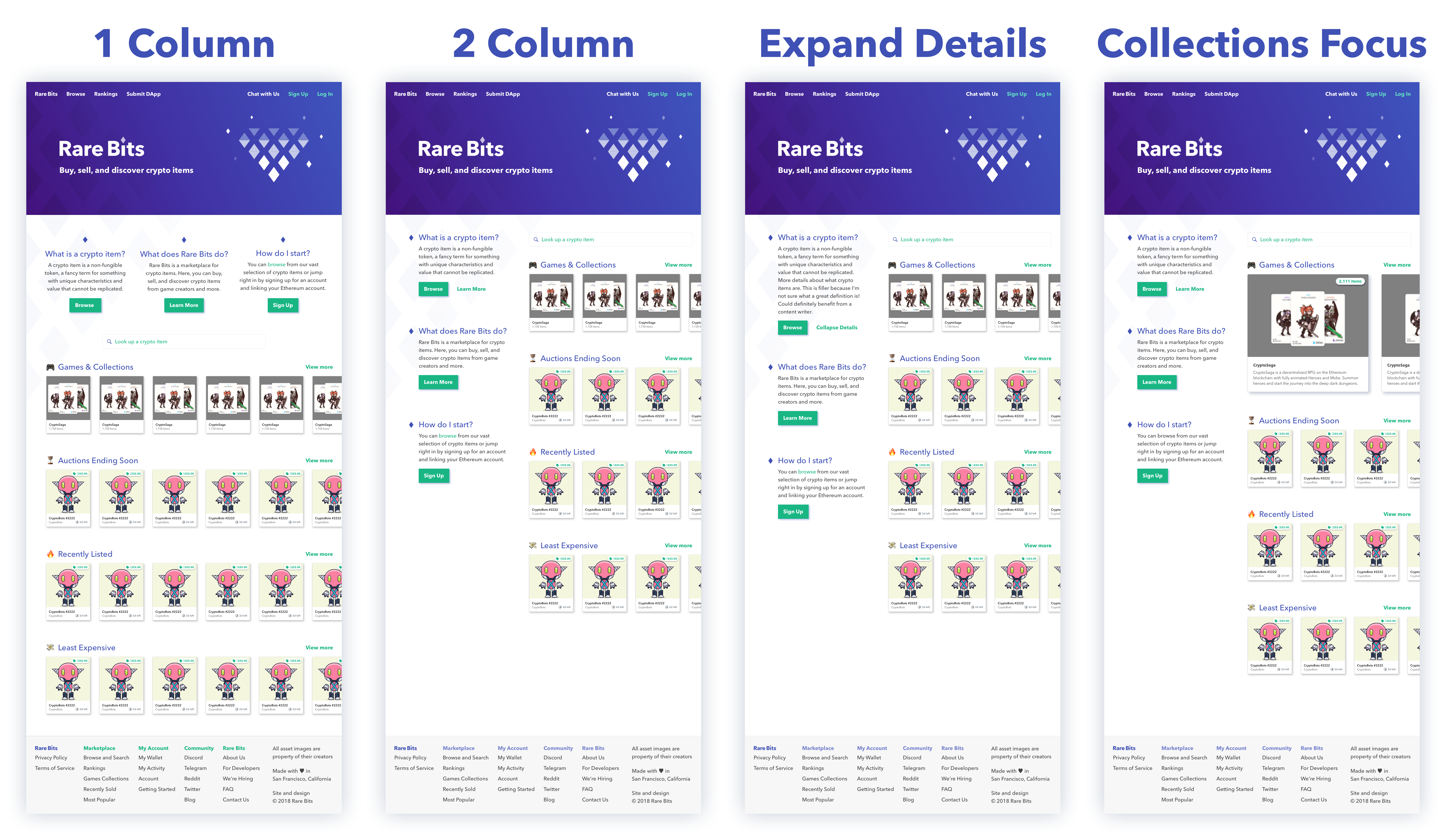
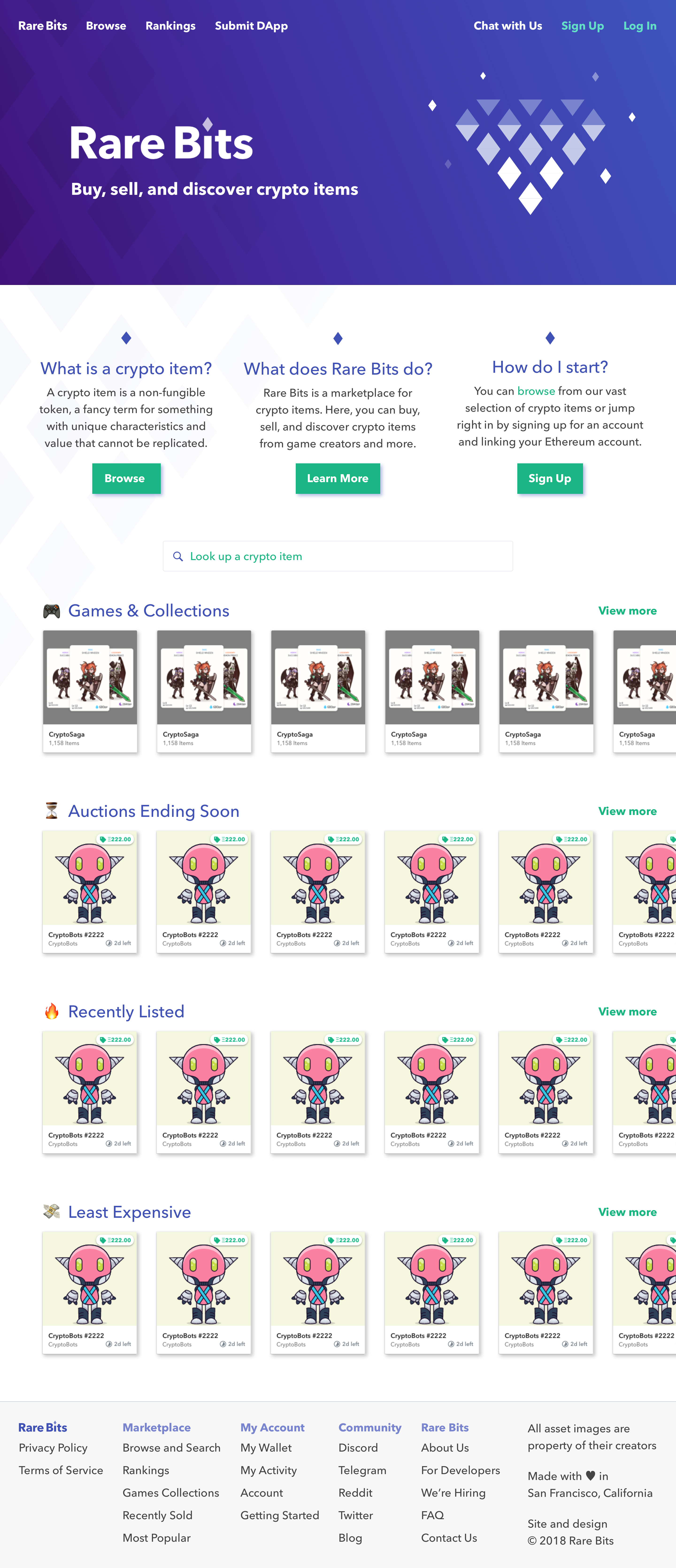
After analyzing the pros and cons from varying aspects of the design, I designed a few different layouts. I made more than one because we have hypotheses, but don't have strong data supporting that better onboarding will result increased new user auction activity. If this was a real project I was working on, I would recommend A/B testing different layouts and measuring the analytics against the previous metrics mentioned (maintain user traffic and increase new user auction activity). Here are the designs I mocked up and why I made each one:
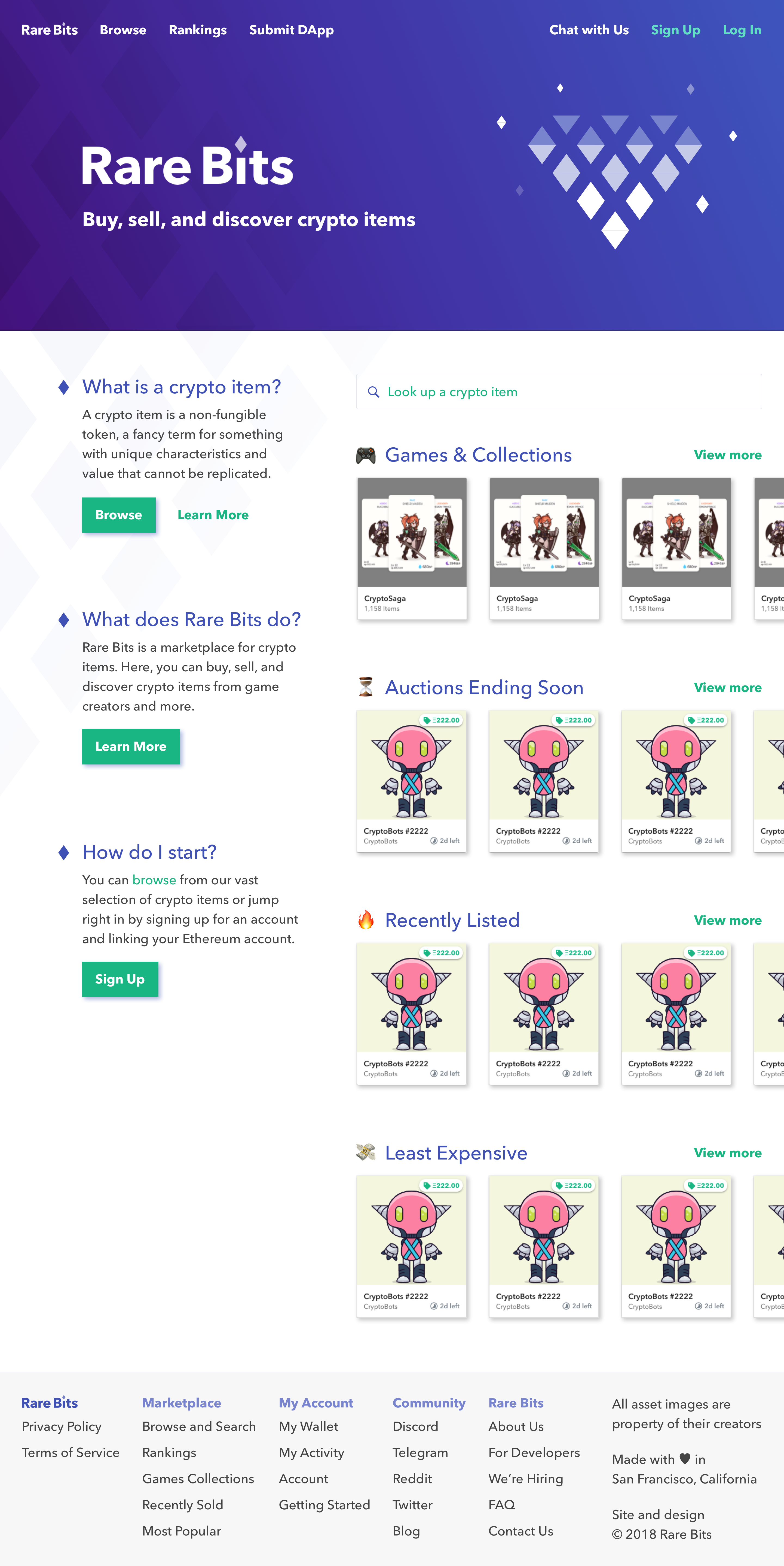
- One-column: Shows all onboarding education above the fold.
- Two-column: Equal hierarchy between new user onboarding and marketplace items.
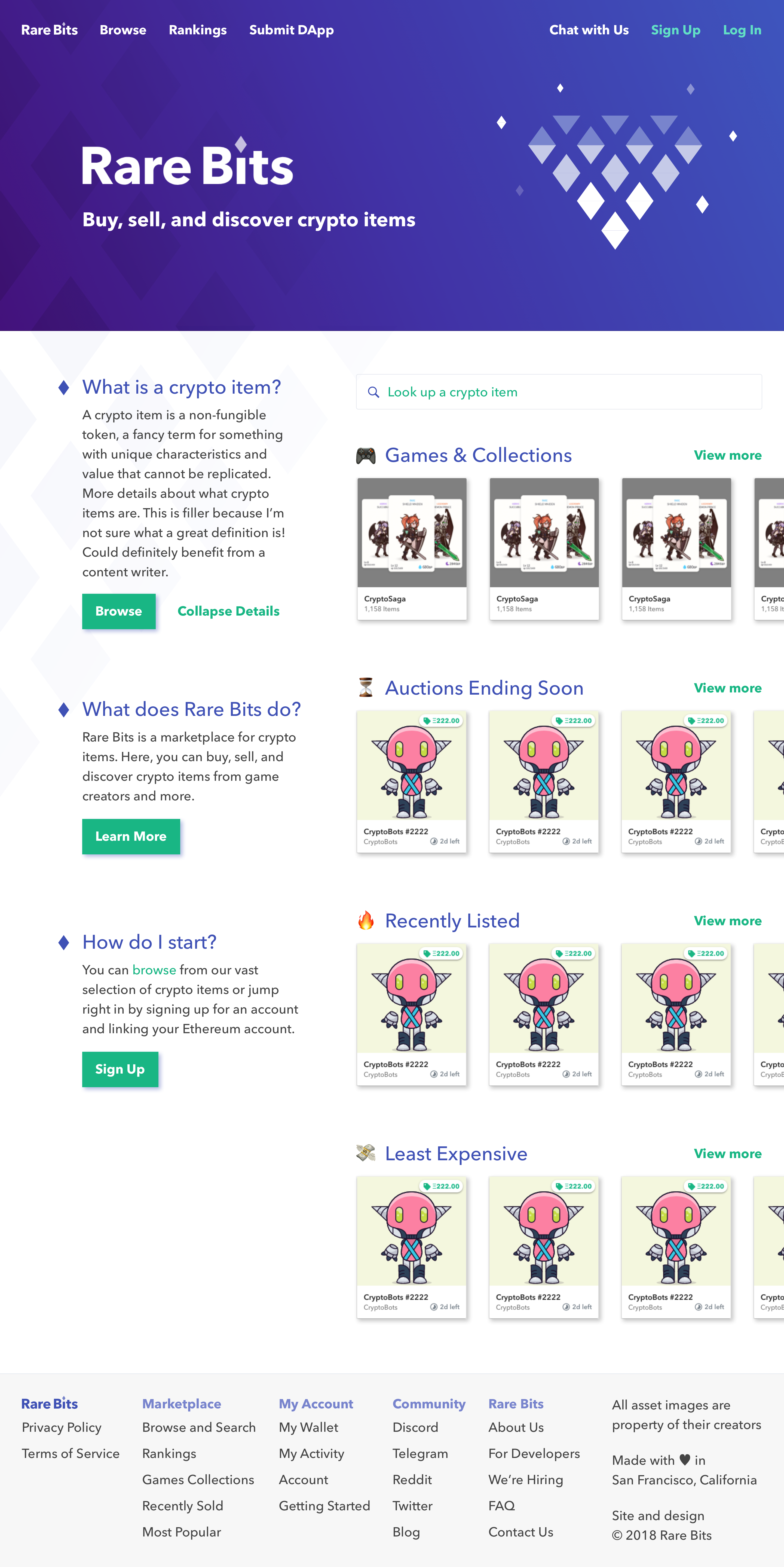
- Expanded Details: Allows brief explanations with more details as an option.
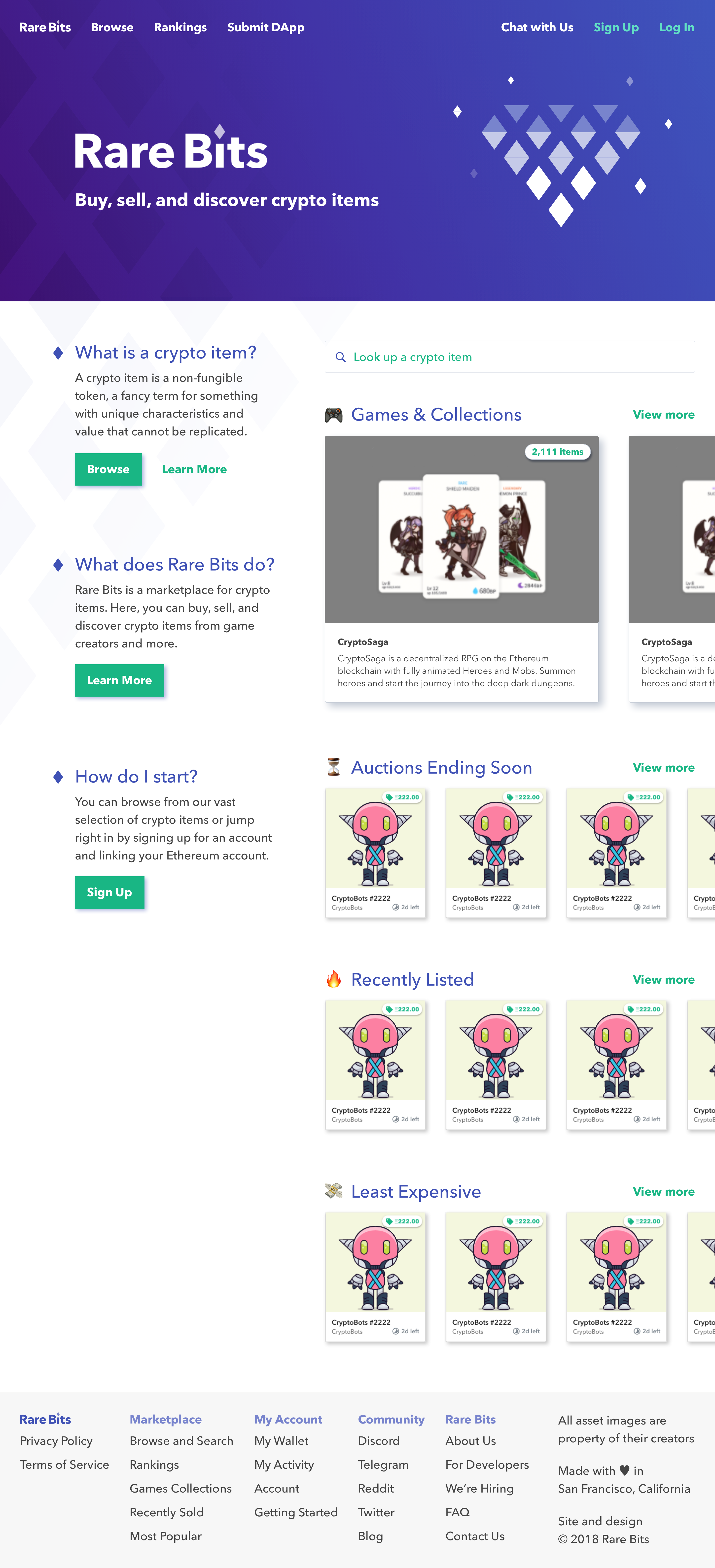
- Collections Focus: Gives more weight to games and collections instead of items.
View PDF of Designs
Icing on the cake
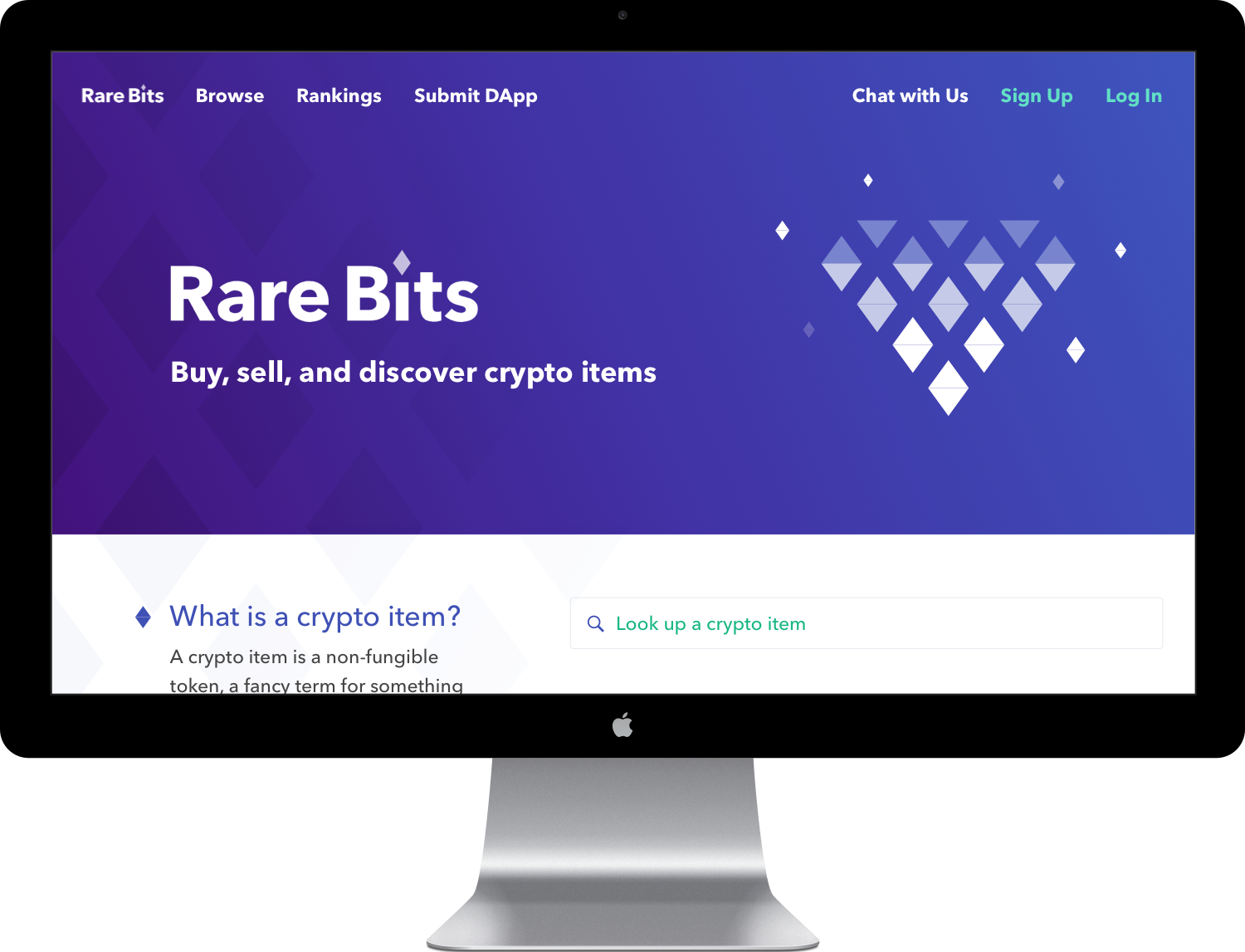
The gemstone logo looks pretty cool and really adds character to the brand. I added a bit of my own touch to it (can you spot it?) and made a subtle animation for the header. A little pizzazz can go a long way!
If I had more time
Since I time-boxed myself and this was not a real project, here are some things I would've liked to explore:
- I wasn't really able to address an important user story: "I want a low risk way to try a cryptogame." I think I need more context around how Rare Bits works in order to lower this barrier to entry for these users.
- I would've liked to conduct user research to find out:
- How did they discover Rare Bits?
- Are they interested in using Rare Bits? Why or why not?
- What makes sense vs. what's confusing on the current homepage? Anything that can be better explained?
- How would they describe cryptogames to someone who didn't know what they were?
- Looking at the analytics to see if there are any groups of people that drop-off at specific parts of the funnel. Or any other behavioral analytics that can be used to make a new hypothesis and layout design to A/B test.
- Test more or vastly different layouts. The mocks I ended up with are based off a strong hypothesis that marketplace items need to stay on the homepage for new/non-logged in users. This might not be the case and it could be interesting to convert it completely into an informational onboarding page.
Bonus feedback
I had a bunch of different thoughts and ideas as I explored the Rare Bits site. Here are some of them:
- A tutorial video and/or step-by-step illustrations might increase new user activity. I didn't mock these up since they're not part of my skillset.
- The responsive breakpoints make the layout look broken/weird at some sizes. Could be improved.
- For those unfamiliar with cryptocurrency, should there be an estimated dollar conversion rate somewhere on the page? Or a way to toggle between Ethereum and USD or other currency?
- Would be cool to see very personalized pages for content creators. Storytelling is very important in games and hand-crafted products. People will pay a premium for good storytelling.
- New user sign up flow seems confusing, especially for someone who has never invested in any cryptocurrency. Metamask also seems confusing to set up. How can the barrier to entry be lowered?
- Is there a reason why Rare Bits and Fan Bits are separate? Why not rarebits.io/creators so everything is all in once place?
Full notes
If you're interested in seeing all the notes, click the link below! Thanks so much for reading. It was a really fun challenge!
View Full Notes
