Forecaster is a product made for pricing analysts. It provides pricing recommendations and also allows the analyst to provide manual overrides when needed. Ideally, the most optimal software would price everything correctly according to supply and demand. However, the algorithm behind the recommendations always requires some subjective human input to tweak pricing for events like a special holiday or conference. For this project, I started as the UI designer and after onboarding to the project for a couple months, I became the sole UX and UI designer.
Note: While reviewing these screens, please keep in mind that the users of this application are power users that are used to consuming large amounts of data and utilizing certain vocabulary and definitions that are niche to their industry.
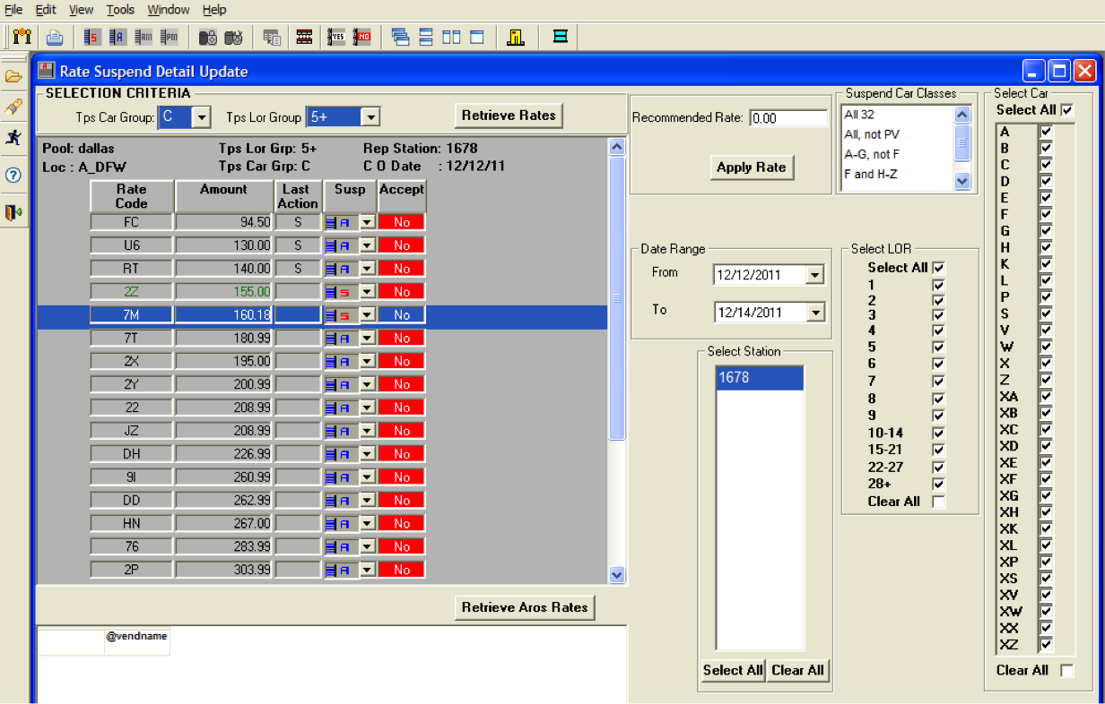
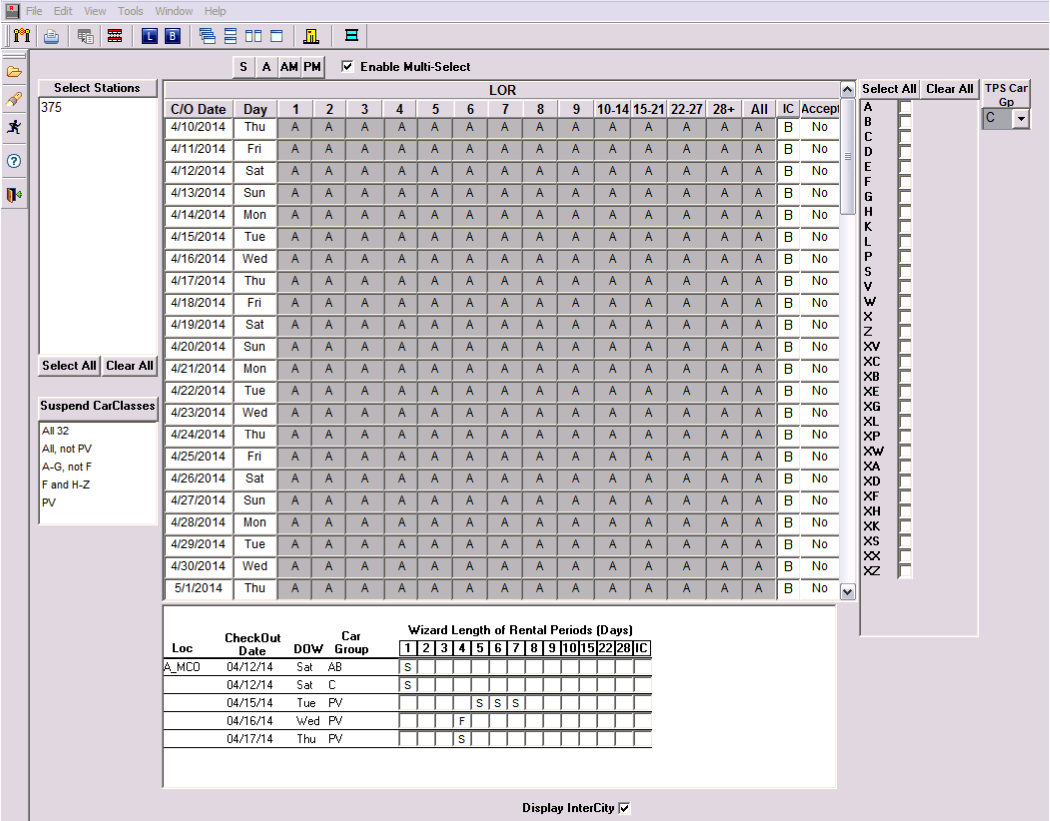
The application used by the pricing analysts was extremely dated and cumbersome to use. It was packed full of features, but the presentation of the information made it very difficult to consume and act on.
I brought the product managers, developers, and data scientists together and organized a mini design sprint to design an entirely new application that addressed the core workflows of the pricing analysts. Together, we re-assessed the primary user stories for the pricing analysts and designed a product that addressed their needs.
Our users were working in a really old application. Just by looking at the application, we truly felt the pain of our users. On the other hand, this was a great opportunity to provide a drastically improved user experience.
At the start of this project, I provided UI design support while working with a UX designer. The UX designer wanted to build a solution with UX improvements and a visual design overhaul while maintaining the overall infrastructure of the existing application. After a couple of months, the UX designer was moved to another project, so I stepped into the role of both UX and UI designer.
I wanted the team and I to start from scratch and really dive deep into the primary workflows of a pricing analyst. I spent the first several days with the product manager (a subject matter expert with former experience with the application) just to understand the daily workflow for a pricing analyst. I then kicked off the design initiative by bringing the Forecaster team together and in alignment with the problem at hand. I organized a mini design sprint and together we worked through our facts vs. assumptions, doodled storyboards, sketched our ideas, and had long, meaningful discussions about the design. We even engaged into rigorous conversations with the team behind the recommendations algorithm to better understand the science behind it all. By the end, we knew we needed to focus on these user stories:
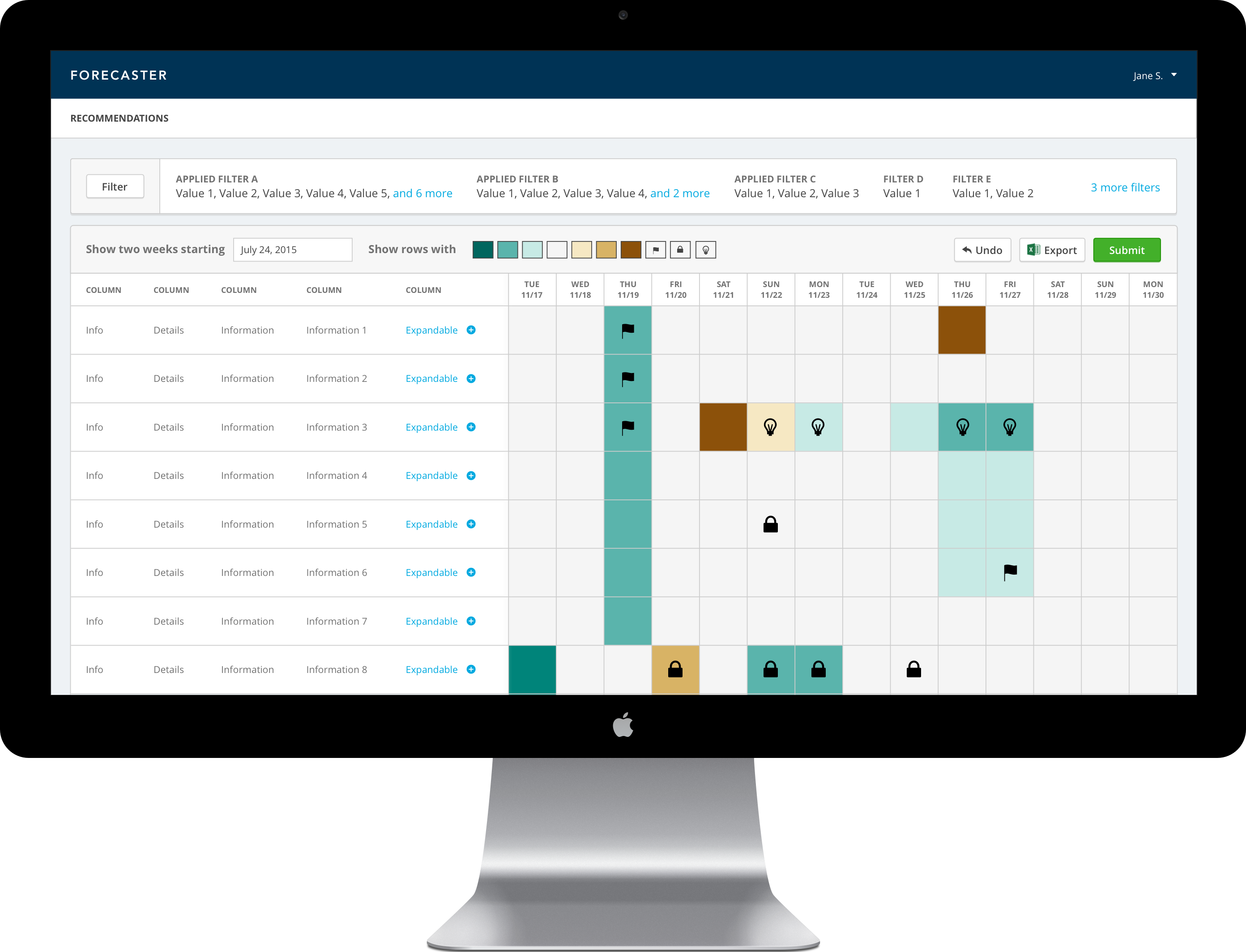
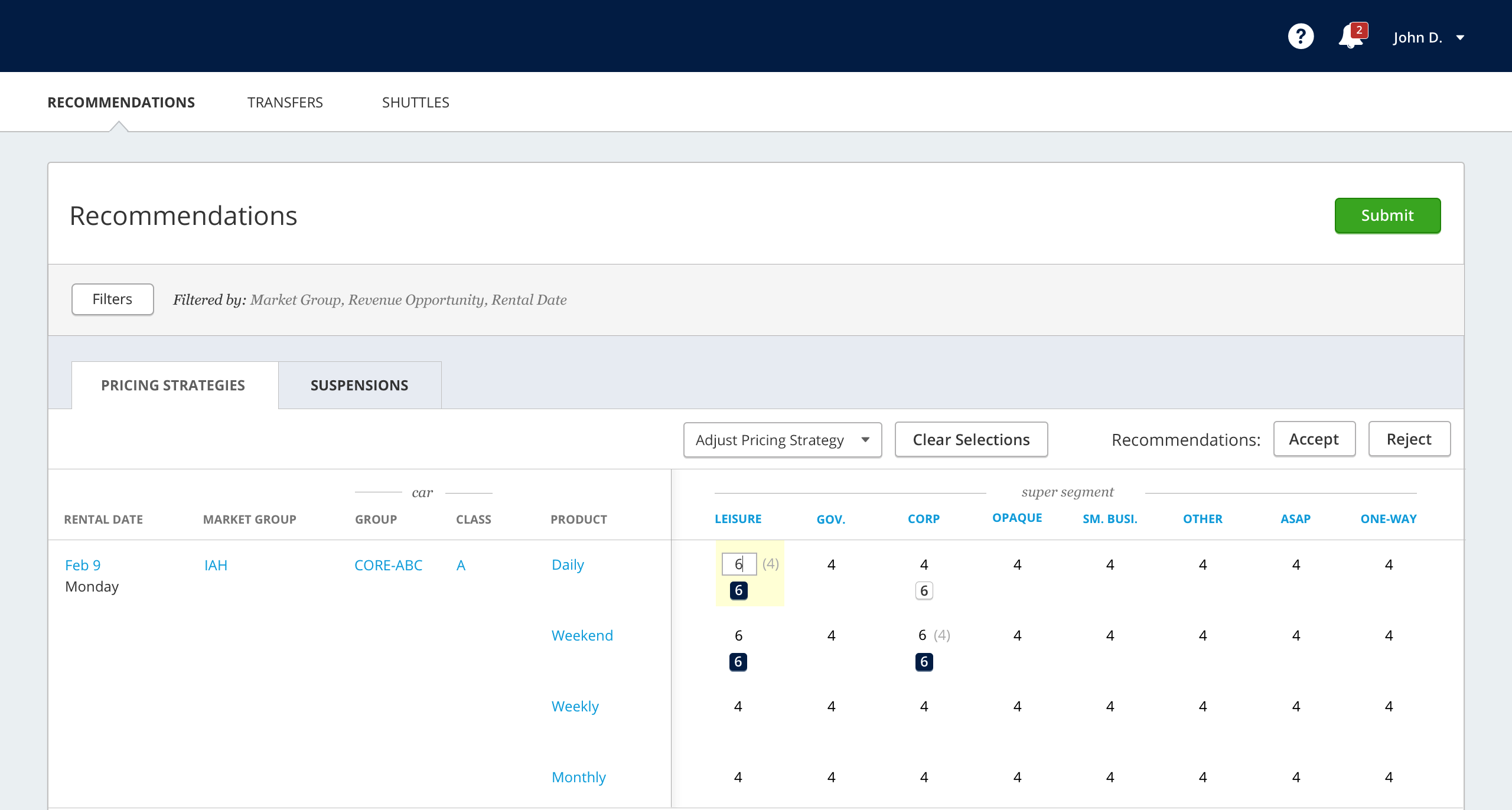
After many sketching sessions, the team was able to agree on a design that we all felt was more usable and cleaner to implement technically than the old design. So far, we have received highly positive reviews from informal feedback sessions with our users. Just recently, we received the approval to conduct usability testing and look forward to that in the next couple months. I'm concerned about the click-target sizes, so I'm excited that we get the opportunity to test that aspect as well as the overall intuitiveness of the design. Please see the video or click the button below to view the prototype of the application.
As a bonus, below is a recording of a prototype I made to visualize what a future iteration might look like. This method uses colors instead of numerical 1 to 7 values to represent the pricing strategy. I wanted try getting feedback from the analysts on decluttering their screens and providing a heatmap that could help the analysts better see patterns from a high-level view.
The hardest parts of this project:
The best parts of this project: