Analytics App Project Overview
This app was built for pricing analysts who needed to check information about their prices while they were away from their desktop. It was designed specifically for the tablet because our research showed that a phone design would provide little to no value due to the lack of screen real estate. I the lead UI designer throughout this project and I was responsible for overseeing all UX requests after the initial wireframing phase.
Sketching
Our team normally starts with user research, but due to an aggressive timeline, myself and two other designers brainstormed with the product manager while our UX researcher helped us plan our initial round of testing. To get the project up to speed, our team spent several days with the product manager to get some ideas flowing and to help shape some business requirements.
Research
Our UX researcher recruited and conducted interviews with potential users to assess the need and value for our concept. These interviews allowed us to validate our market and learn a lot more about our target users and their goals. Their feedback also helped us quickly discover that users preferred a tablet to a phone application due to screen size. Users commented that the lack of real estate on phones rendered the application useless due to the level of detailed analysis needed. This research discovery prevented our team from spending countless hours designing for a case that users would never need.
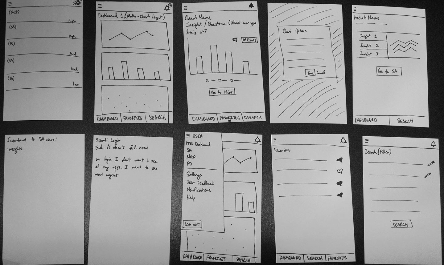
Wireframing
Our first round of research helped our team convert initial assumptions into validated facts about our users' wants, needs, and personas. With that information in mind, we proceeded to wireframe and layout the information architecture of the app and iterate with research to hone the product.
More Research!
My team and I built a high-fidelity prototype on a tablet and scheduled an on-site visit with 12 potential users from a Fortune 500 company. My two teammates and myself divided the users into 3 groups, so I was personally responsible for moderating a prototype walkthrough for 4 of the 12 participants. I walked them through our prototype to get a sense of whether our product provided enough value to fit into their daily workflow and to note their suggestions for improvement. We were also able to test the usability of certain aspects of the design such as success rates with touch targets and gesture interactions.
High-fidelity designs
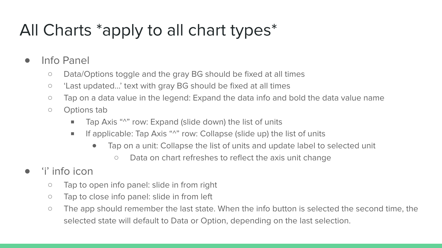
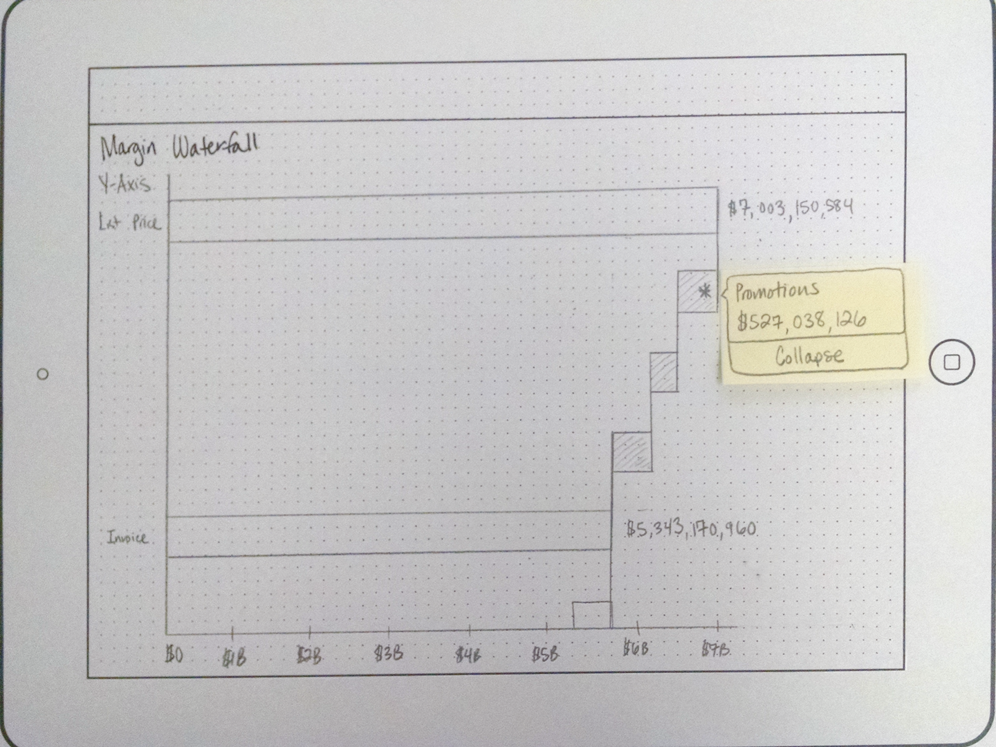
By this point, we had received significant positive feedback through multiple rounds of user testing and proceeded with completing all the high-fidelity design deliverables for development. I designed over 40 screens and provided extensive documentation detailing gesture interactions. It was important to detail every interaction that could possibly exist on each screen to ensure proper feedback for the user. This attention to detail allowed for a smooth, seamless experience as opposed to a static, haphazard one. A lot of the UI was inspired by the principles of Material Design. After documenting all of the interactions and designing the screens, I spent a lot of time side-by-side with developers to resolve any gaps in interaction design, provide support in daily standups, attend sprint demos, participate in retrospectives, and provide UX quality assurance to ensure that what was developed was what was envisioned by the UX team. Below is a snippet of the interactions documentation and a video animation to show the flow of the app in action.